
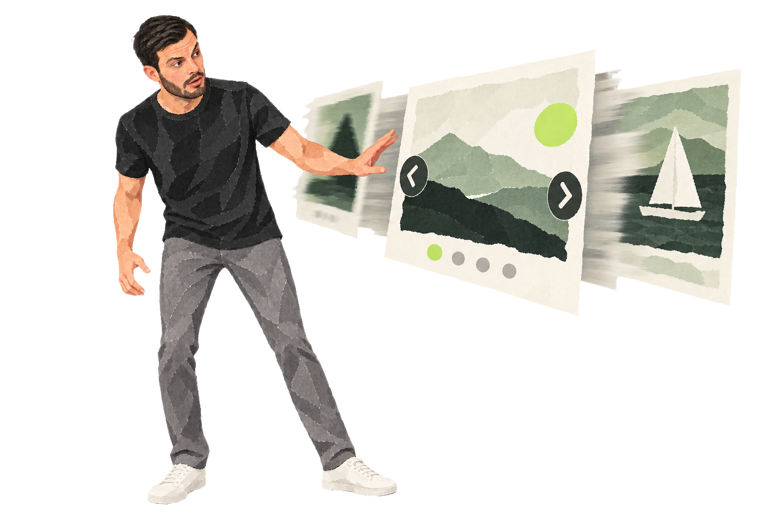
When building websites for clients, I am often asked to add a slider or carousel: a large set of images that changes every few seconds, usually on the homepage. I tend to advise against it. I think sliders are often hard to use, can make a site slower, and can weaken its focus. Here is why.
Hard to use
Visitors want to control how they browse. Moving content can make a page harder to follow and may encourage people to leave. Static content is often easier to use. Studies of web usability, including work discussed by Jakob Nielsen, support that impression.
People rarely wait
Visitors often scan a page quickly. If you put five messages in a slider, only the first one may be seen before someone moves on.
Several large images can also slow a page down. That may affect the experience and how easily people find the site.
Focus
A slider lets you avoid choosing one main message. But if everything gets a turn at the top of the page, visitors may not know what matters most. What do you want them to do? As thequotesuggests, a lack of focus can leave people confused and more likely to leave.
If you are still unconvinced, take a look at this website.